Contents
Safety Signs, Symbols and Colour Codes – a simple guide
Welcome to Free Sign
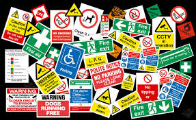
We have a large selection of OSHA and statutory signs for you to print out using your PC and it’s printer. We have available the most commonly used safety signs you might need to comply with todays Health and safety regulations.
Our signs are quick and easy to use. Simply find the sign you want, press print and your done. Quick and free.
We will be expanding our collection of safety signage and if there is something you are looking for and can’t find just let us know and we will try and help you.
| Latest Signs | ||
 Do not enter when light is on OSHA caution sign |
 Be proud of the job you do OSHA quality control sign |
 Do not enter test in progress OSHA danger sign |
 Employees only OSHA safety first sign |
 This water is unsafe to drink OSHA notice sign |
 Before you act OSHA think sign |
 No dogs except assistance dogs No dogs except assistance dogsprohibition sign |
 warning you are entering an area where tobacco smoke may be present warning you are entering an area where tobacco smoke may be presentwarning sign |
 High Visibility jacket must be worn mandatory sign High Visibility jacket must be worn mandatory sign |
| All the signs on Free Signage are in Adobe PDF format and as such you will need to havethe Adobe Reader software installed on your PC to print our signs.
The Adobe Reader software is free and can be found at www.adobe.com Need to make own signs click the clink http://www.online-sign.com/ Bringing you free to print pipe markers, labels, tape and duct markers http://www.pipemarker.co.uk/purple.php |
||
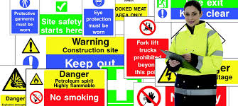
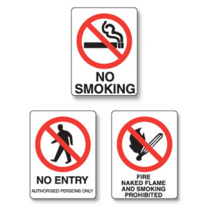
Colours and symbols appropriately used can provide ever-present information and warnings of hazards which are essential to safety at work, and in some instances may be independent of language
The Health and Safety (Safety Signs and Signals) Regulations 1996 require employers to provide and maintain safety signs where there is significant risk to health and safety that has not been avoided or controlled by other means (e.g. safe systems of work) provided that the use of a sign can help reduce the risk. All workplaces and activities where people are employed are covered (with exceptions relating to the transport and supply & marketing of dangerous substances, products and equipment). They also require, where necessary, the use of road traffic signs in workplaces to regulate road traffic. Employers must also ensure that all employees receive appropriate information, instruction and training regarding safety signs. Although most signs are self-explanatory, some employees (particularly young or new workers) may be unfamiliar with the signs used.
SO WHAT IS A SAFETY SIGN?
A safety and/or health sign is ‘information or instruction about health and safety at work on a signboard, a colour, an illuminated sign or acoustic signal, a verbal communication or hand signal.’ These terms are all detailed in guidance to the regulations.
A signboard is a combination of shape, colour and symbol or pictogram made visible by adequate lighting and which may have supplementary text.
Signboards, including fire safety signs, are designed as follows:-
Where the marking of dangerous locations is deemed necessary (e.g. highlighting the edge of a raised platform or area or restricted heights) yellow & black or red & white stripes may be used.
Traffic routes should take the form of continuous lines, preferably yellow or white.
Advice on fire safety signs can be obtained from your local fire authority. In general, where signs comply with the appropriate current standard (ISO 7010) they will not require changes for the Regulations.
EFFECT ON EMPLOYERS-SAFETY SYMBOLS
Most firms already use safety signs to warn and instruct employees of risks to their health and safety. The signboards specified in the Regulations are already covered by the existing British Standard BS5378 and ISO 7010, replacing BS 5499 ‘Graphical Symbols and Signs’. Equally, the law already requires suitable illuminated signs and acoustic signals to be used where necessary. Although the regulations specify a code of hand signals for mechanical handling and directing vehicles, they permit other signals to be used where necessary e.g. BS7121 Code of Practice for the safe use of cranes.
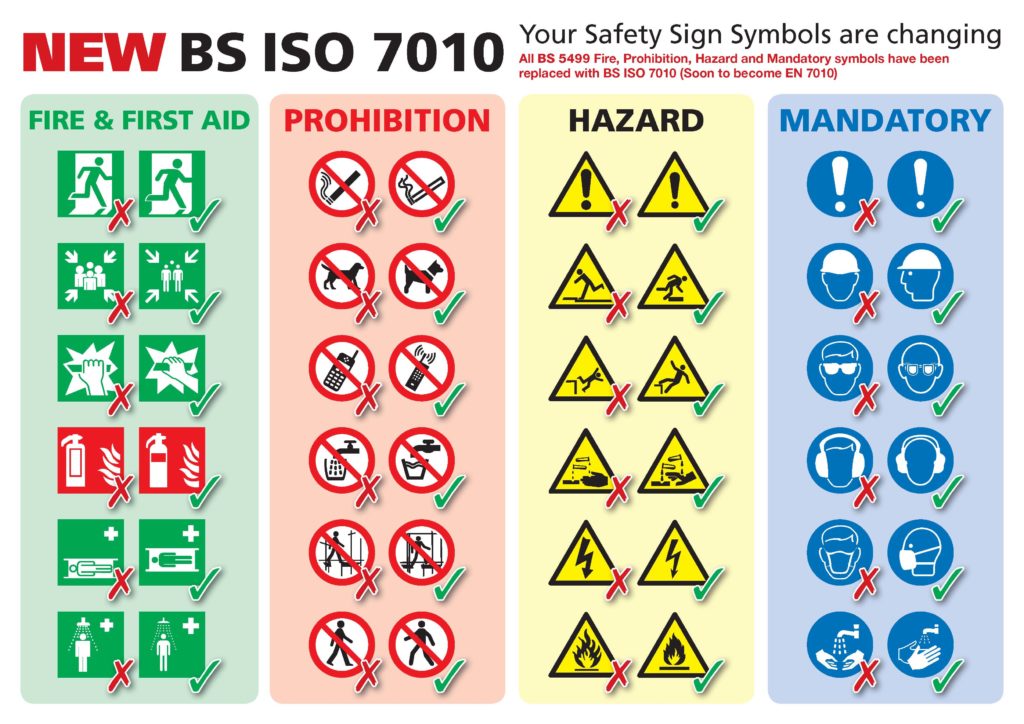
ISO 7010 has now been implemented
Large elements of the British Standard BS5499 symbols have now been changed. The new symbols based on the international standard ISO 7010 have been introduced. The basic principles of understanding safety symbols have remained the same i.e. colour and shape of out line symbol but some of the icons/symbols have changed.
What does it cover?
It aims to bring about consistency in safety signage internationally, though it recognizes that only the national standards organizations of Austria, Belgium, Bulgaria, Croatia, Cyprus, the Czech Republic, Denmark, Estonia, Finland, the Former Yugoslav Republic of Macedonia, France, Germany, Greece, Hungary, Iceland, Ireland, Italy, Latvia, Lithuania, Luxembourg, Malta, the Netherlands, Norway, Poland, Portugal, Romania, Slovakia, Slovenia, Spain, Sweden, Switzerland, Turkey, and the United Kingdom are obliged to adopt it.
The date for adoption was January 2013, when it became a European Normative. Therefore, at that time, it replaced BS5499-5, the previous British Standard.
Is it the law?
No. British Standards are not law. They are Codes of Practice, generally affecting only new products, as opposed to those previously produced. However, it is possible for standards to be given a type of legal status when they are referred to within legislation or government-issued guidance and Approved Codes of Practice.
In this case, the relevant legislation is the Health and Safety (Safety Signs and Signals) Regulations of 1996, also known as the Safety Signs Regulations. These regulations implemented EC Directive 92/58/EEC. They have not been updated, and there’s no apparent plan to change them just yet to incorporate BS EN ISO 7010. Therefore, even though some sales literature implies that all your safety signs (including fire escape signs) must be replaced, that simply isn’t the case.
What do they look like?
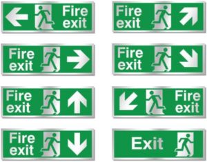
Before 1996, the standard for fire escape and other safety signs was set out in BS5499. Signs looked like this, for example.
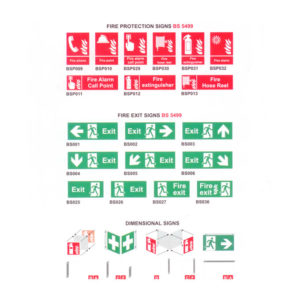
Those who are longer in the tooth will recall the fuss when we had to add the running man to our signs. Then the Safety Signs Regulations brought a new style of fire escape sign — the one with the ice-cream box.
The guidance on these regulations published in 2009 (still the most current version) stated that businesses could continue to use the BS5499-5 fire escape signage if they preferred. Luckily for many of us, BS5499-5, our old and trusted standard for fire escape signs, was used as the basis for BS EN ISO 7010. If you didn’t put up the European standard signs when they became available after 1996, your building is now back in fashion.
What should building managers do?
There’s no requirement to replace signs, and it’s highly unlikely that any such requirement will ever be introduced. It’s best not to mix sign types; the guidance recommends consistency in style and design throughout a building (e.g., BS9999:2008). However, this is only a recommendation, so it isn’t illegal to mix sign types.
Nevertheless, consistency will be much more important in public buildings. On that basis, if you’re adding a few signs to a building that consistently follows EC Directive 92/58/EEC, it’s worth seeking out matching signs, at least for the time being, even though they’re not designed to the latest standard. If you’re starting from scratch with a new building, go with the new standard. And if your situation is somewhere between those two, do what seems most logical.
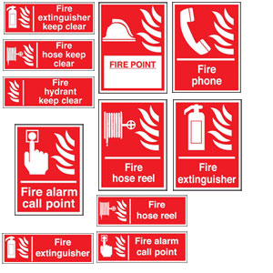
At least, the fire escape and fire fighting equipment signs all use very familiar symbols. If you start using them, you shouldn’t need to retrain staff. (The same can’t be said for all the general safety signs under BS EN ISO 7010.)

